Finnish foods for exporting
Fresh packages for birch sap drinks
We here in Finland have great resources and the world’s cleanest nature. It’s easy to build great packaging based on that.
For the packaging designer its very rewarding to get to build a completely connected and organised brand all the way from the start and in compact co-operation with the client. The arctic Raw products have been designed from the exporting point of view and are targeted especially targeted for Asian markets, but the packaging designs do also work globally.
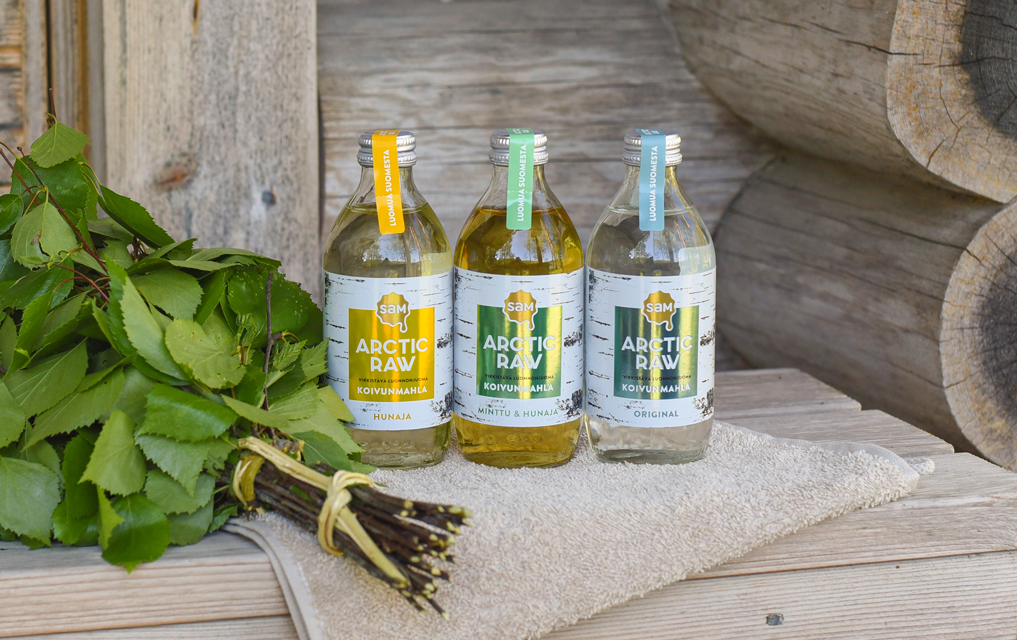
We wanted to communicated the authentic Nordic flavours and Finnish materials through packaging design and all the brand’s communication channels. Halusimme kertoa pakkaussuunnittelulla ja kaikella brändin viestinnällä aidoista pohjoismaisista mauista ja puhtaista suomalaisista raaka-aineista. Brändi luottaa paikallisiin elementteihin, kuten puhtaan valkoiseen koivun runkoon ja suomalaiseen metsään ja sen antimiin.
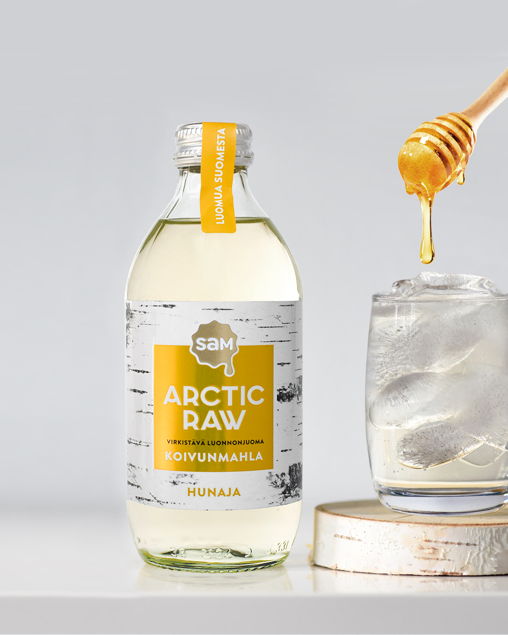
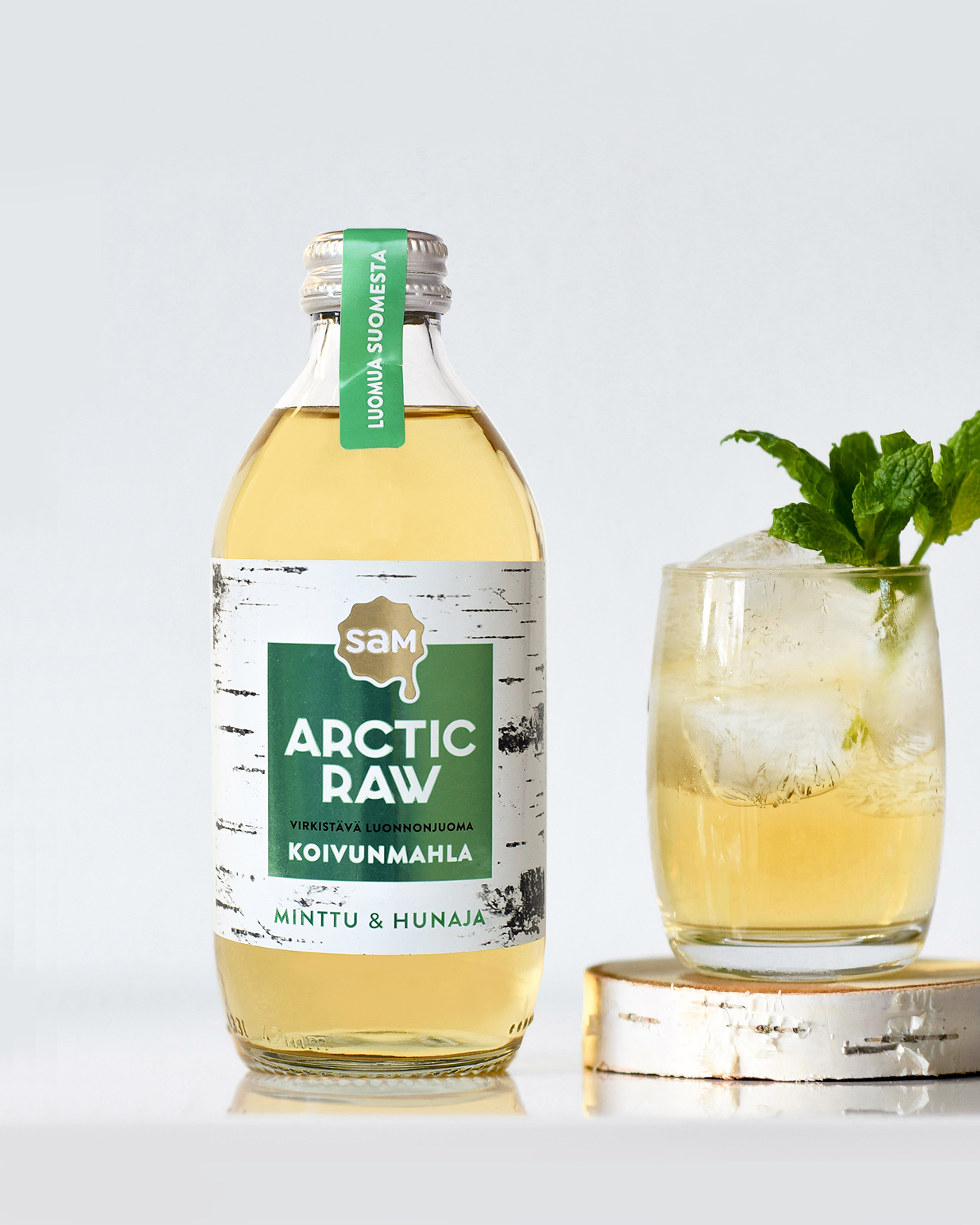
In addition to birch sap drinks the Arctic Raw series already includes honey and Finnish dried berries. The birch sap drinks have honey and mint honey as flavours. There’s also of course a refreshing unflavoured variant, which is bottled straight from birch sap in the spring. The products don’t have artificial ingredients or added sugar.
Your brand can make a first impression only once; at the moment the customer picks up your package for the first time.
Outi Oravainen
DesignCompany
The package feels quality in your hand
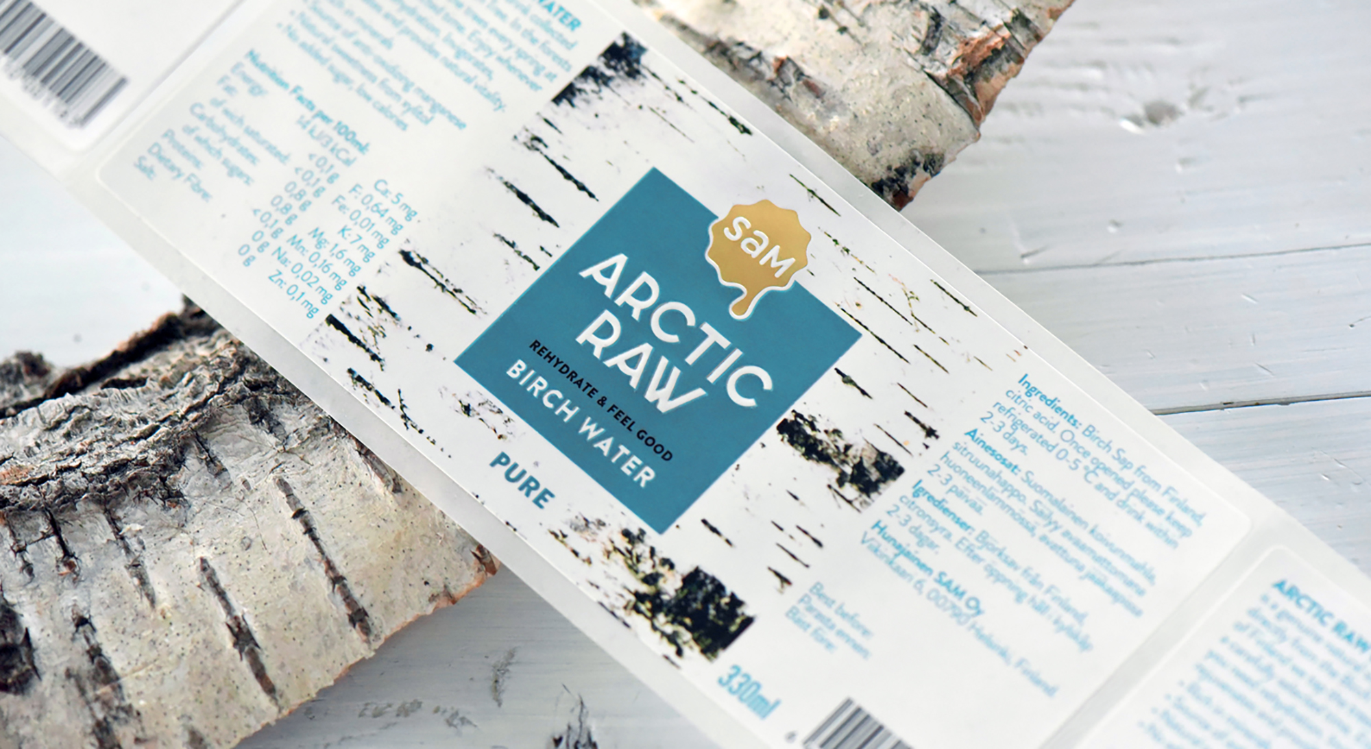
To express the legitimacy and pureness we wanted the labels to be as fresh as possible. It was also important to show the product inside the package. Each flavour variant was designed to be told apart by the foiling on the front label. There’s other well thought-out special effects in the labels as well. Along with foiling the labels also have a hoarse coating to mimic the feel of a birch tree. From the standpoint of brand image building the feel of the package is very significant.
Small details and finishing touches bring value to the brand
The seal label on the cap finishes the appearance of the product. Investing in the seal was surprisingly important for these packages to be visible on the store shelves. The colourful seal and its core message connects the design well and Without it the package would’ve been left more unseen and pretty ordinary.
In addition to the packages I’ve also taken product images and designed marketing materials like PowerPoint presentations, leaflets and advertisements for Arctic Raw.