Local quality down to the package
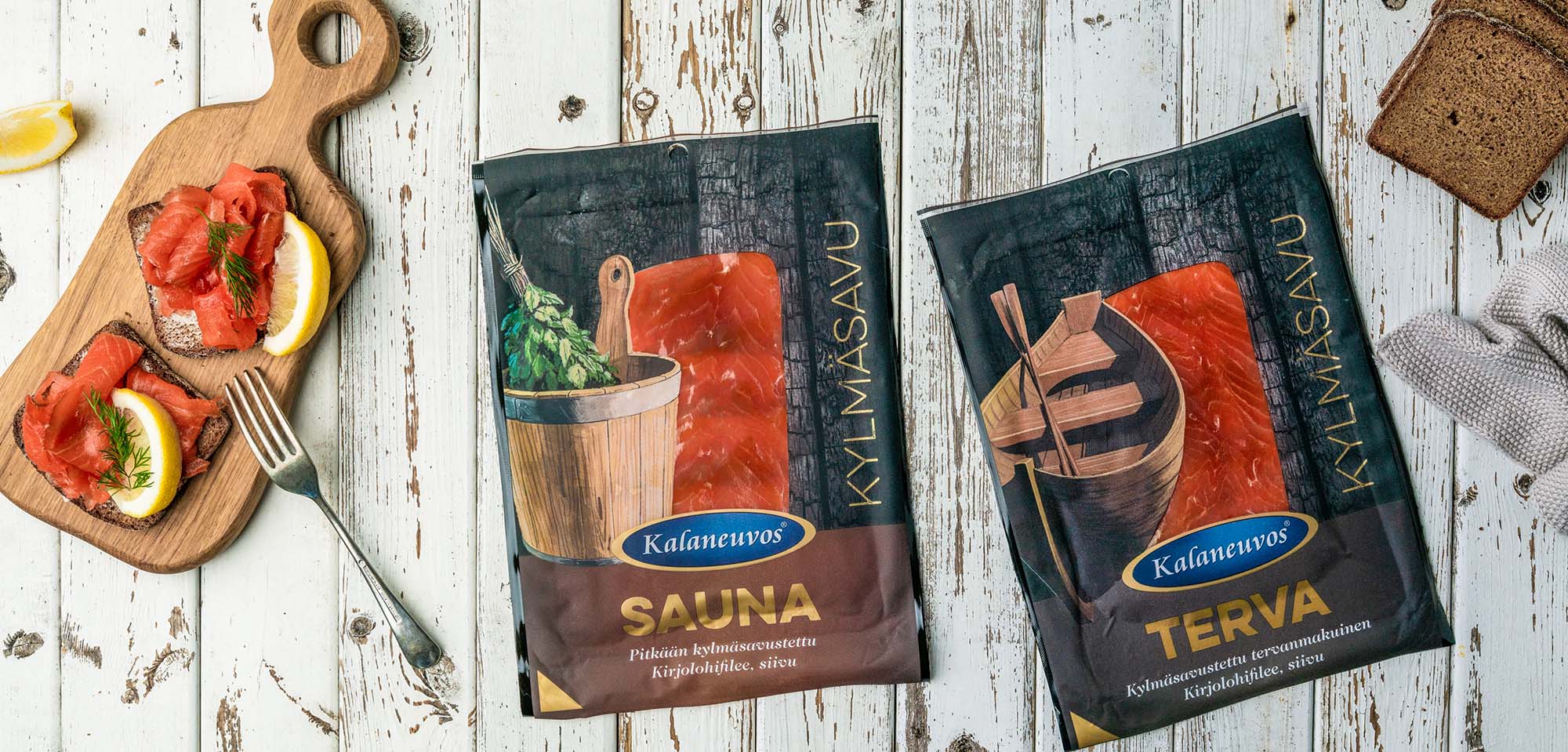
The Kalaneuvos packages Sauna, Terva ja Viima
You can even design a totally new product series based on an existing visual identity. Even so, that the new product series has a look of itself and is still in line with the existing packages.
When designing the Sauna, Terva and Viima packaging our goal was to create packages that look new while still fitting the same brand identity as the existing packages. We wanted to design the packages to communicate the strong and Finnish but still innovative flavours.
We wanted to make the plentiful flavours clear with artwork, such as Kalaneuvos packages had not yet seen. At the same time the locations of the well working elements were kept the same as in the existing packages. The new products are recognisable and good-quality Kalaneuvos products with a new twist.
The artwork was created together with the client throwing around ideas. The dark illustration images create gorgeous contrast for the reddish shade of the rainbow trout. The matte varnish used in the packages finishes the Finnish style of the artwork very well.
These new packages stand out on store shelves while still preserving the recognisable Kalaneuvos brand identity.
It’s very quick and easy to work with Outi Oravainen. I especially appreciate the agility, brave suggestions and Outi’s natural design.
Mari Heikkilä
Brand and communications manager,
international operation,
Kalaneuvos Oy